SharePointのリストからPower Appsでカスタムフォームを作ると、複数の項目を選択できる列はコンボボックスで作られる。
機能的には全く問題ないんだけど、これをチェックボックスに変更できないか試してみた。
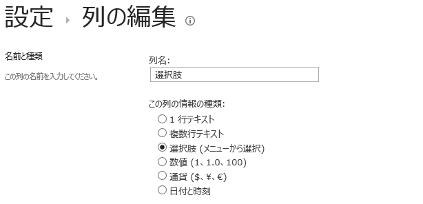
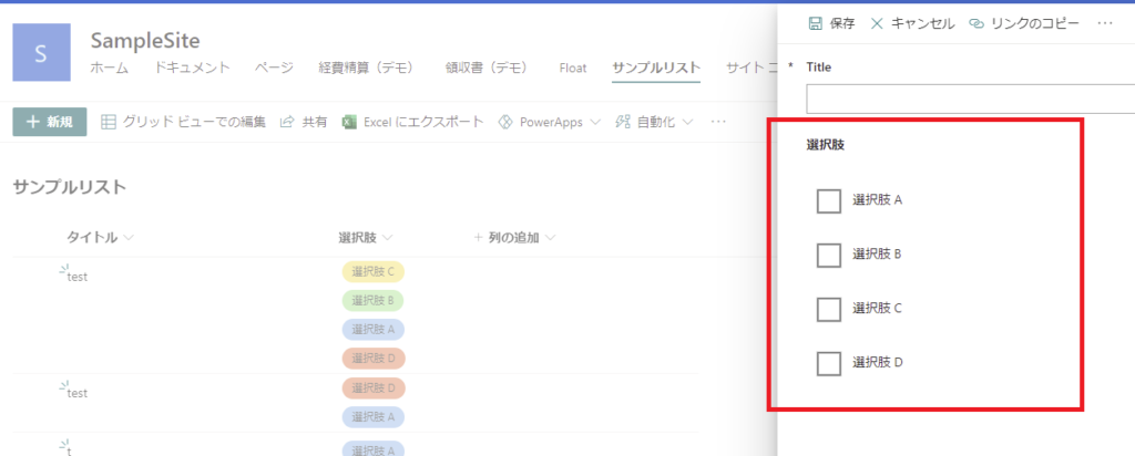
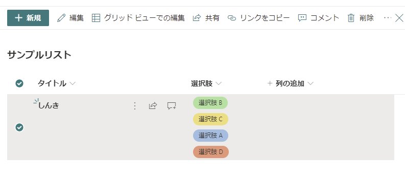
SharePointの複数選択列
SharePointのリストでは複数の項目を選択可能な列を作ることができる。
列の編集で[選択肢]を選んで、
[チェックボックス]を選ぶ。
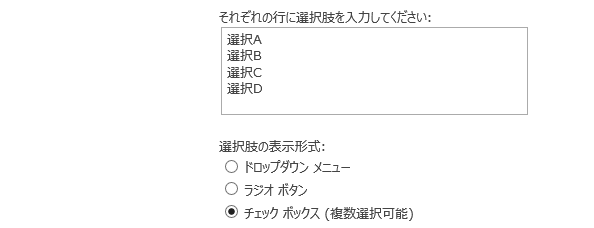
そうすると複数項目選択できるようになる。これは標準フォームの見た目。
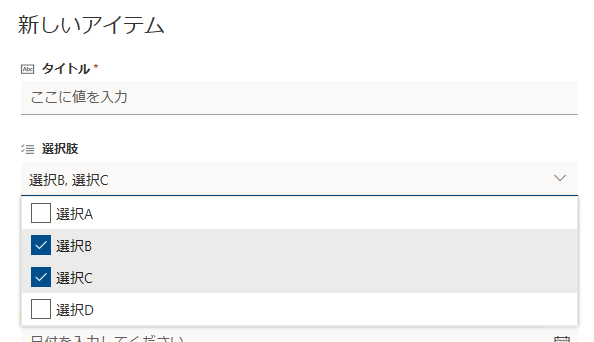
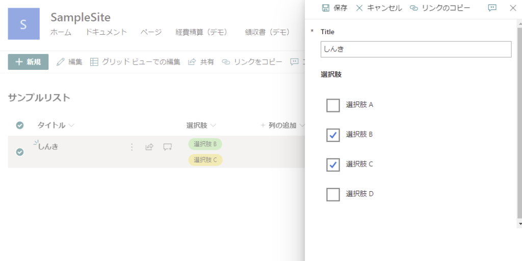
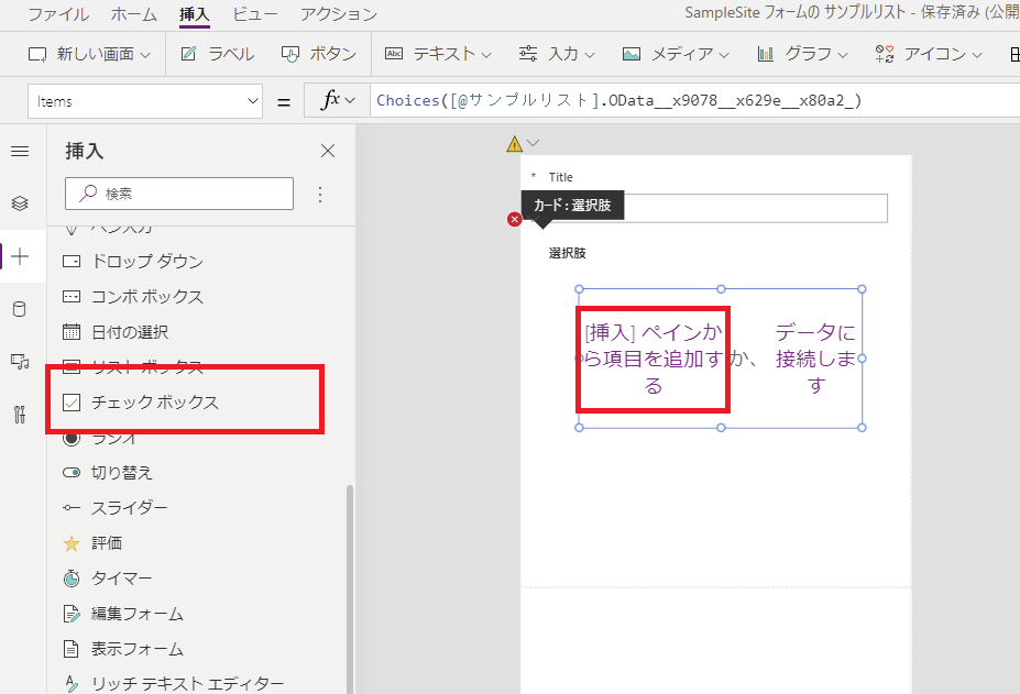
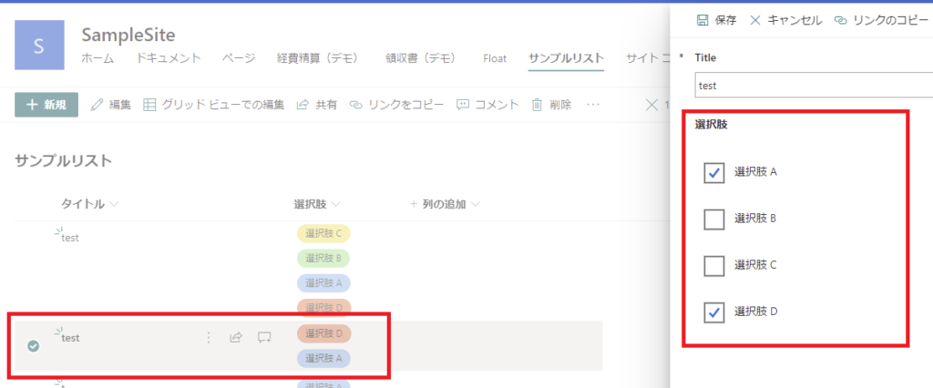
Power Appsでカスタムフォームを作ると
この複数の選択肢を持ったSharePointリストからカスタムフォームを作成すると、この列はコンボボックスで表示される。
アイテムを複数選択するとこんな見た目になる。
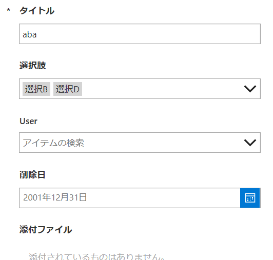
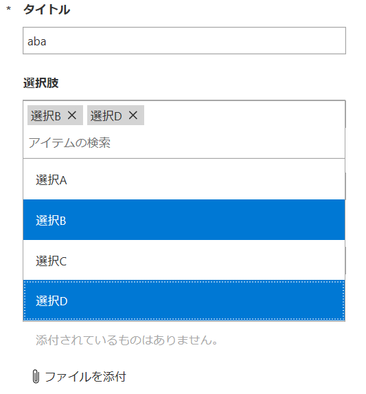
もちろん機能的には問題ないけれど、見た目がいまいち好きになれないので、このコンボボックスを他のコントロールに変えてみた。
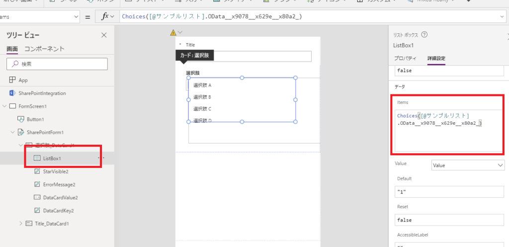
リストボックスで複数選択を実現する
まずはコンボボックスをリストボックスに変えてみる。
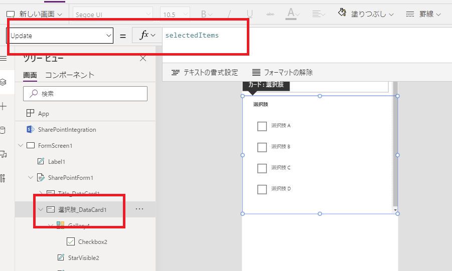
選択肢の列のDataCardの中にリストボックスを追加して、
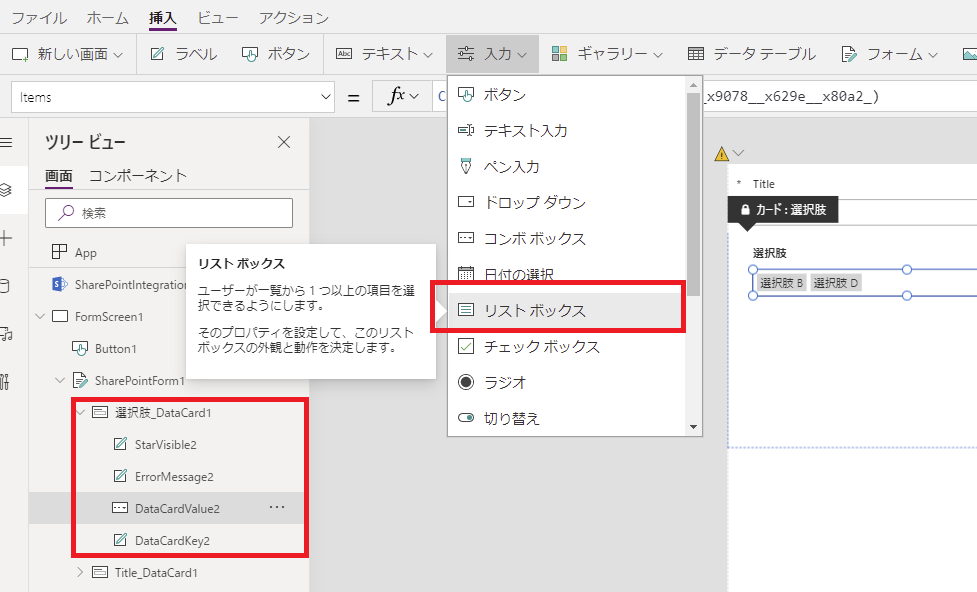
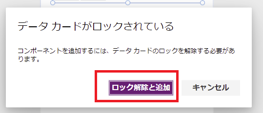
ロックを解除。
元々入っているコンボボックスのItemsプロパティの式を、
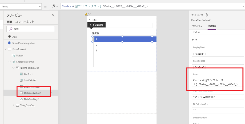
リストボックスのItemsプロパティにコピペする。
そして、DataCardのUpdateプロパティの式をリストボックスのSelectedItemsプロパティ使った式に変えて、
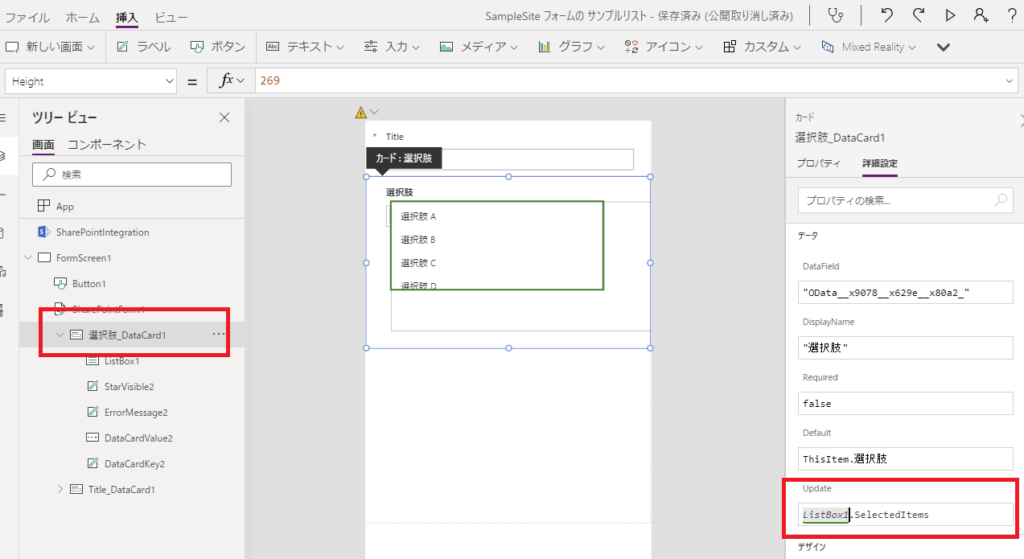
元々あったコンボボックスを消して、リストボックスのX座標とY座標を整えてあげれば完成。
無事複数選択の登録も機能する。
チェックボックスで複数選択を実現
続いてチェックボックスでの実現方法を考える。
DataCardの中に直接チェックボックスを固定数設置してもよかったんだけど、それだとSharePoint側で選択肢を増やしたときにメンテナンスが必要になる。
そこで今回はギャラリーとチェックボックスを組み合わせて、以下の見た目を実現。
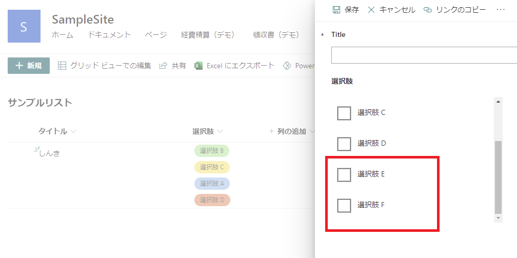
もちろんSharePoint側の選択肢を増やせば、
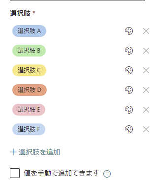
選択肢も増える。
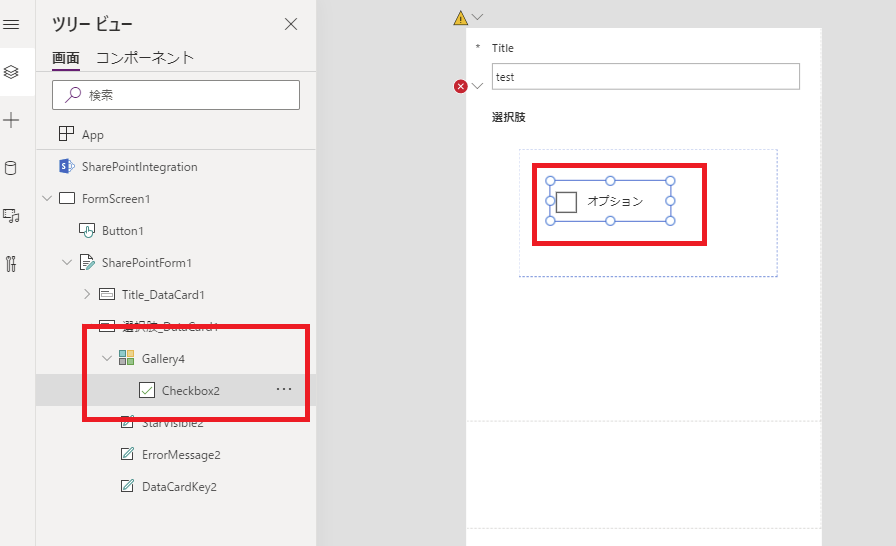
構築手順1:ギャラリーとチェックボックスの追加
まずはフォームにギャラリーを追加する。DataCardの中に空のギャラリーを追加しようとすると、
DataCardの外側に出てしまうので、該当のギャラリーを[切り取り]して、
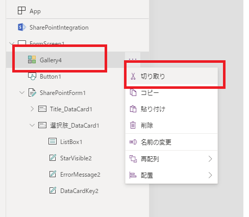
DataCardの中で[貼りつけ]を選択。
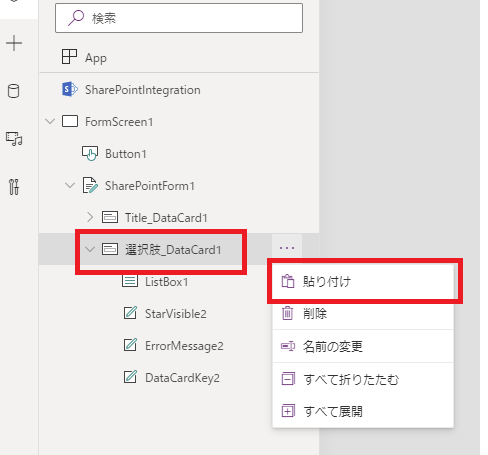
すると無事DataCardの中に入る。
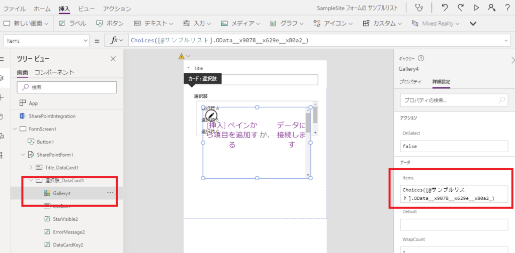
続いてギャラリーのItemsプロパティに、元々コンボボックスに入っていたItemsプロパティをコピペする。
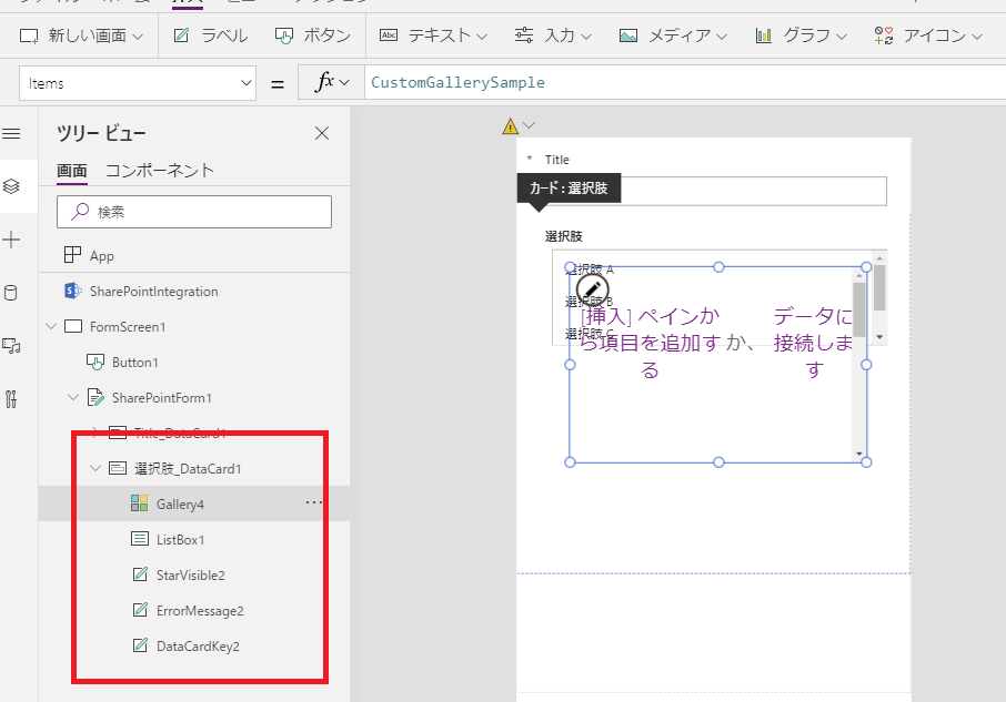
ギャラリーの中にチェックボックスを入れると、
見た目はこんな感じになる。
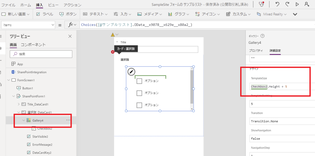
チェックボックスが1個しか出ていないのは、ギャラリーの各アイテムのHeightが大きすぎるからなので、TemplasteSizeをチェックボックスと同じ高さ+余白にしてあげて、
チェックボックスのXとYを0にすると、すべての選択肢が表示される。
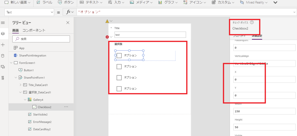
最後にチェックボックスのTextプロパティにThisItem.Valueを入力すると、選択肢のテキストが表示されて見た目が整う。
構築手順2:SharePointリストとギャラリーをつなぐ
フォームが「新規」で開かれたときはすべてのチェックボックスをfalseに、「編集」の場合はそのアイテムの値によってtrueまたはfalseにする必要がある。
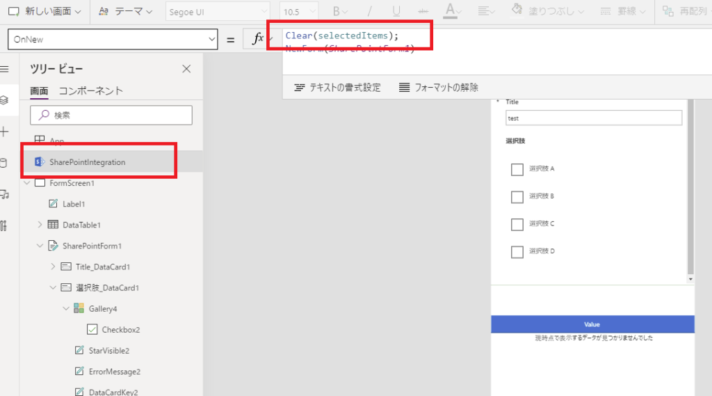
そこで今回は「selectedItems」というコレクションを作って、カスタムフォームが「新規」で開かれるときは中身をClearし、
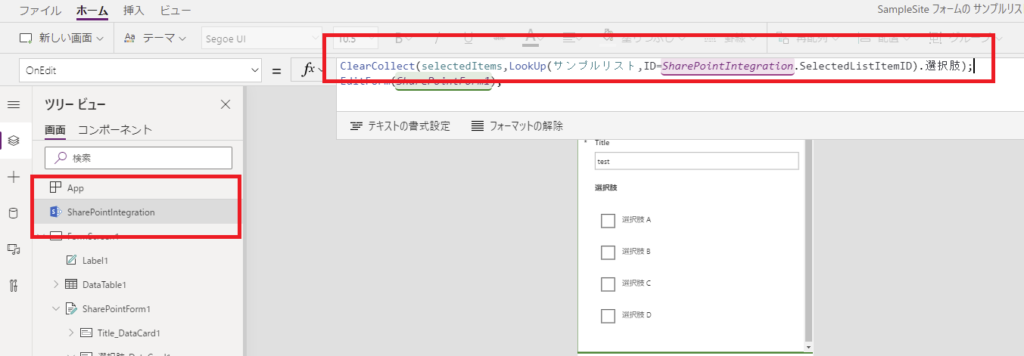
カスタムフォームが「編集」で開かれるときは、そのアイテムの選択状態をClearCollectで追加する。
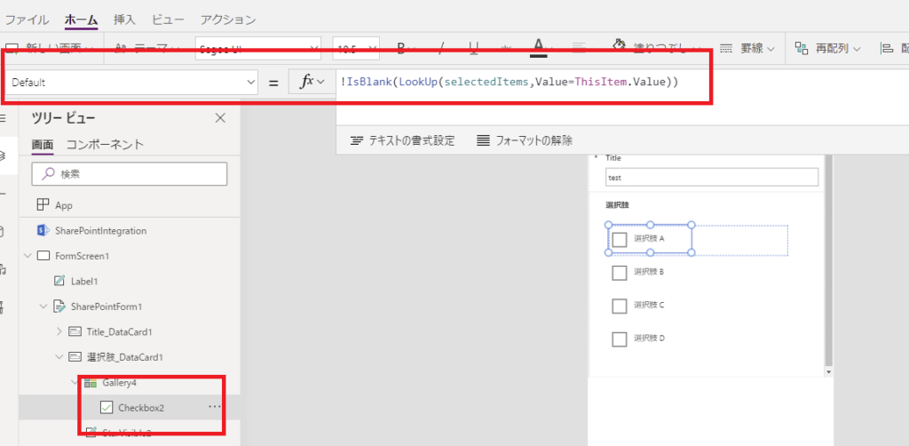
そして、チェックボックスのDefaultプロパティに「ThisItem.Value(選択肢の名前)」と一致するアイテムが「selectedItems」にある場合はチェックする、という処理を書く。
これでリストアイテムを「新規作成」するときはどれにもチェックが付かないし、
「編集」するときは現在の選択状態を再現することができる。
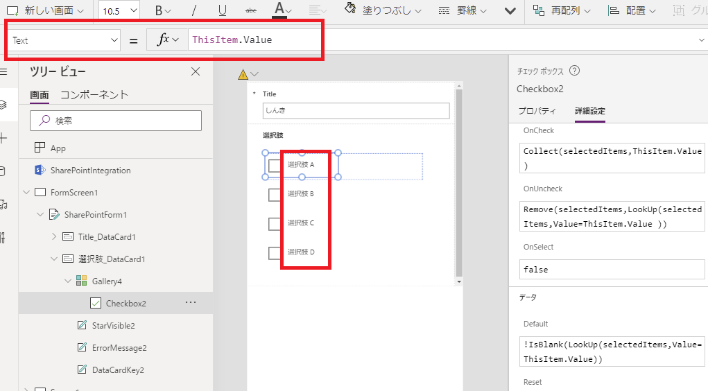
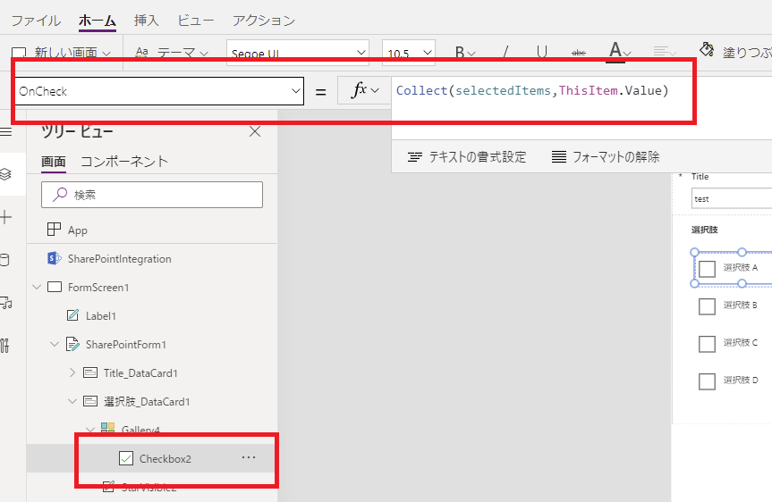
あとはチェックボックスのOnCheckイベントでselectedItemsにチェックされた選択肢を追加して、
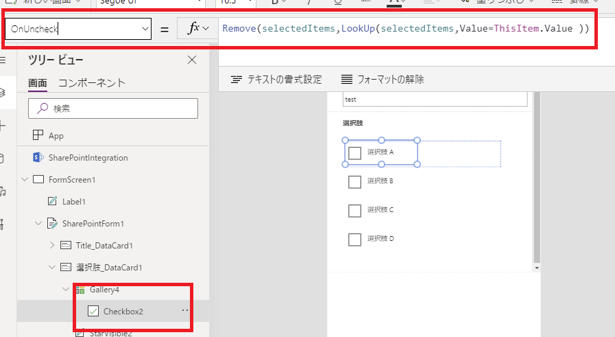
OnUnCheckedでselectedItemsからチェックが外れた選択肢を削除すれば、チェック状態がselectedItemsに保持される。
最後にこのselectedItemsをDataCardのUpdateプロパティの式に書けば完成。
動作確認
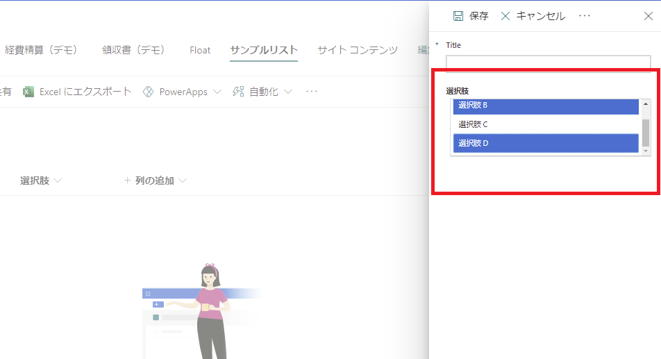
まずは新規でアイテムを追加すると、
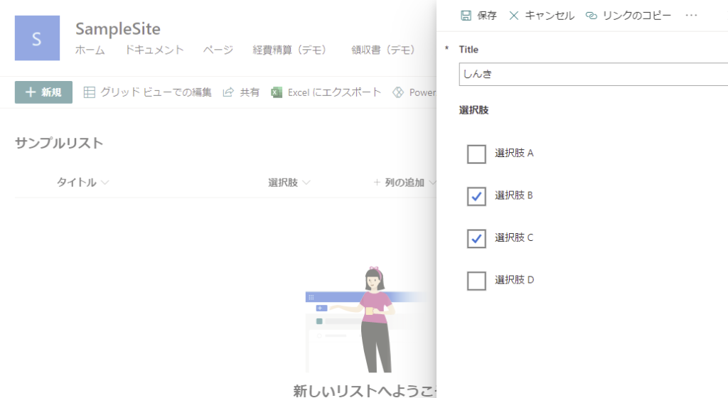
無事に複数登録されて、
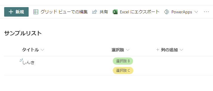
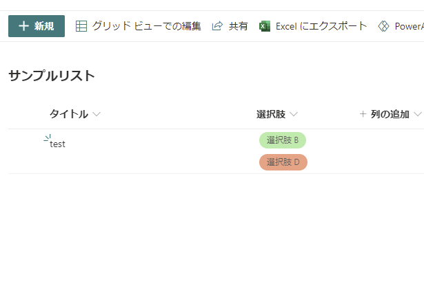
そのアイテムを編集すると、選択状態が復元される。
追加で選択して保存を押すと、
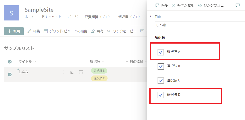
新しく選択した選択肢も登録されるので、無事完成。
コメント
はじめまして。記事読ませていただき、活用させていただいております。
早速質問なのですが、コンボボックスでの複数選択肢をchoice関数で列指定ではなく、filterを用いて別のsharepointリストから選択肢を出すことはできますか?
一つ前の記事の2つのドロップダウンと連携させるものと
組み合わせるようなイメージです。
選択肢に対するdatacardのupdate selecteditemsはchoiceで抽出した列しか参照してくれないのでしょうか?
ドロップダウンの連携をコンボボックスで複数選択で作ると、選択肢が文字列になるのでリストのフィルター昨日使うときに問題が生じてしまいまして、、、
もし分かるようでしたら教えていただきたいです。
よろしくお願いします。
はじめまして!コメントありがとうございます!
コンボボックスの選択肢をSPOリストをフィルターして出すことができるか?というご質問ですが、問題なく実現できるかと思います。
Filter関数を当てたSPOリストをコンボボックスのItemsプロパティに入れ、DataCardのUpdateプロパティには「コンボボックス名.Selected.更新したい列名」を入れてあげればよいかと。
ご参考になれば幸いです。