Checkboxes are commonly used in groups, but Power Apps doesn’t provide a native way to group classic checkboxes. This can be challenging when you need to manipulate multiple checkboxes simultaneously.
If you are using the new Modern Table Control, bulk selection (multi-select) is a built-in feature. You don’t need to build it manually.
However, if you need custom layouts using a Gallery or require complex logic, the method described in this article is still the best solution.
I encountered this limitation while working on a project requiring a highly customized UI, so I’d like to share my solution for managing multiple checkboxes efficiently in Power Apps.
About Checkboxes
Let’s start with some checkbox basics. A checkbox is a control element that has two states: “checked” (true) and “unchecked” (false).
*Note: For single-choice selections, radio buttons are the more appropriate option.
Value property:
- Checked state →
true - Unchecked state →
false
Implementation
Now, let’s implement the bulk operation (“Select All”) for multiple checkboxes inside a Gallery.
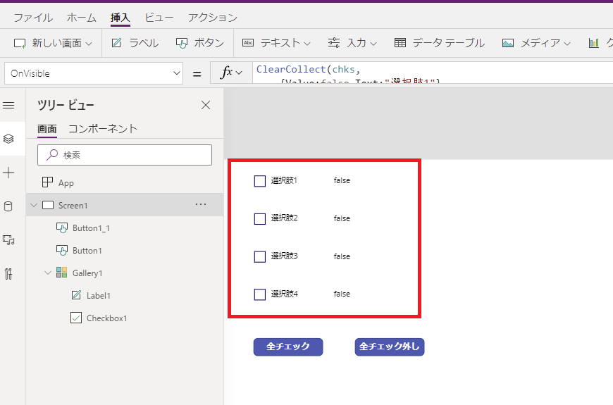
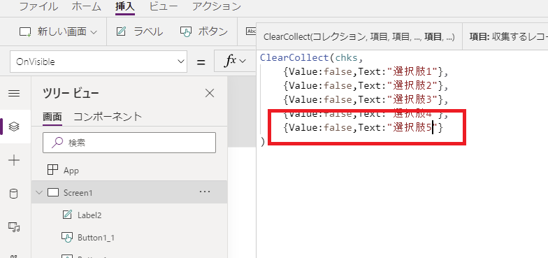
Step 1: Create a Collection
First, create a collection that will serve as the data source for our checkboxes. You can do this in the OnVisible property of the screen.
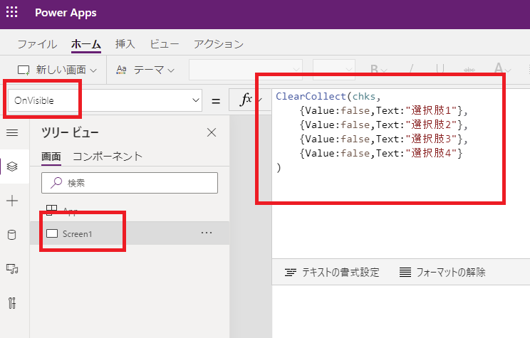
ClearCollect(ColCheckboxes,
    {Name: "Option A", Value: false},
    {Name: "Option B", Value: false},
    {Name: "Option C", Value: false},
    {Name: "Option D", Value: false},
    {Name: "Option E", Value: false}
)
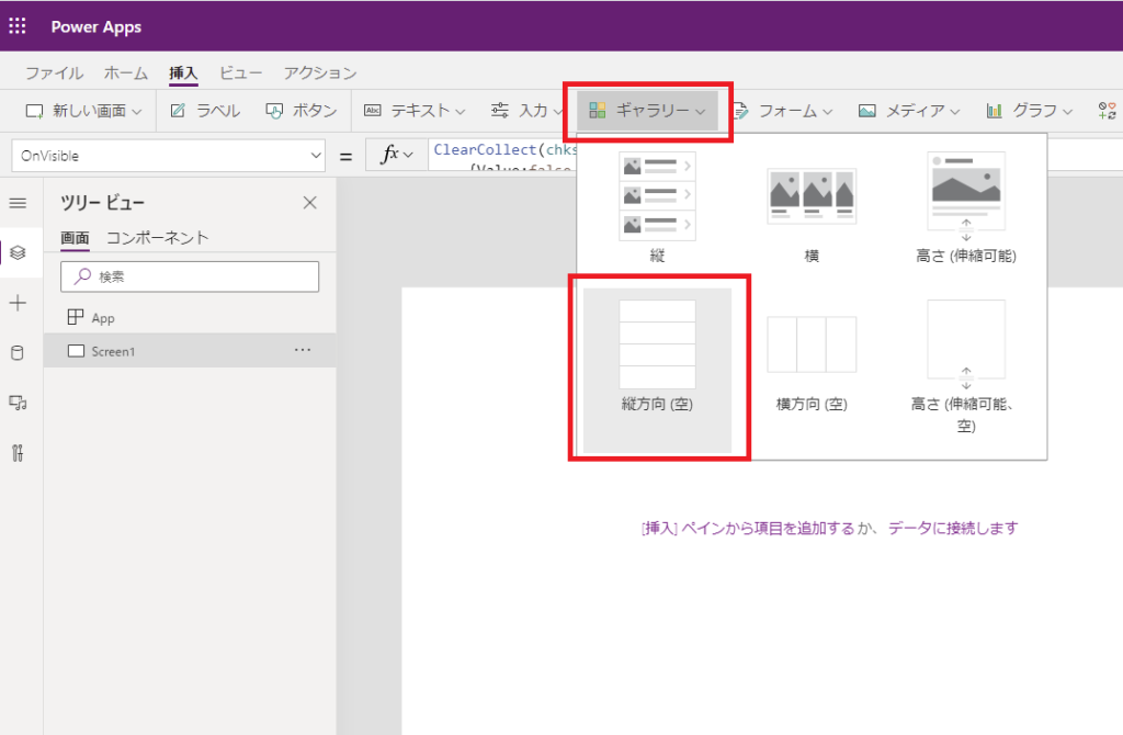
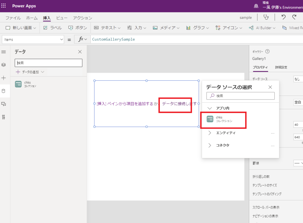
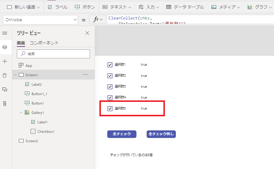
Step 2: Setup the Gallery
Add a Gallery control (Vertical or Horizontal) and connect it to the ColCheckboxes collection we just created.
Step 3: Add Checkbox to Gallery
Add a Checkbox control inside the gallery.
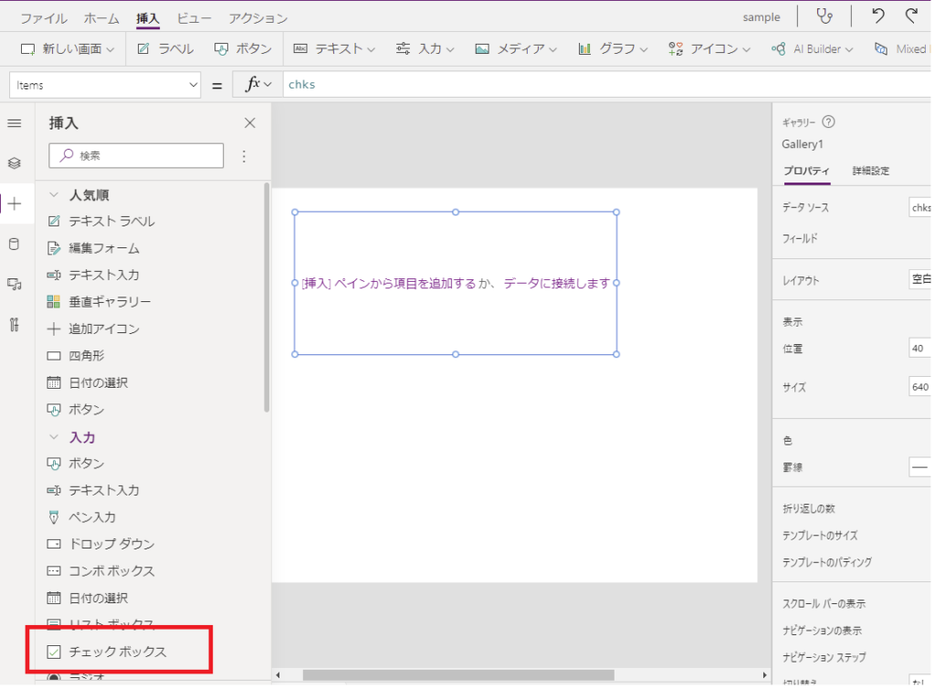
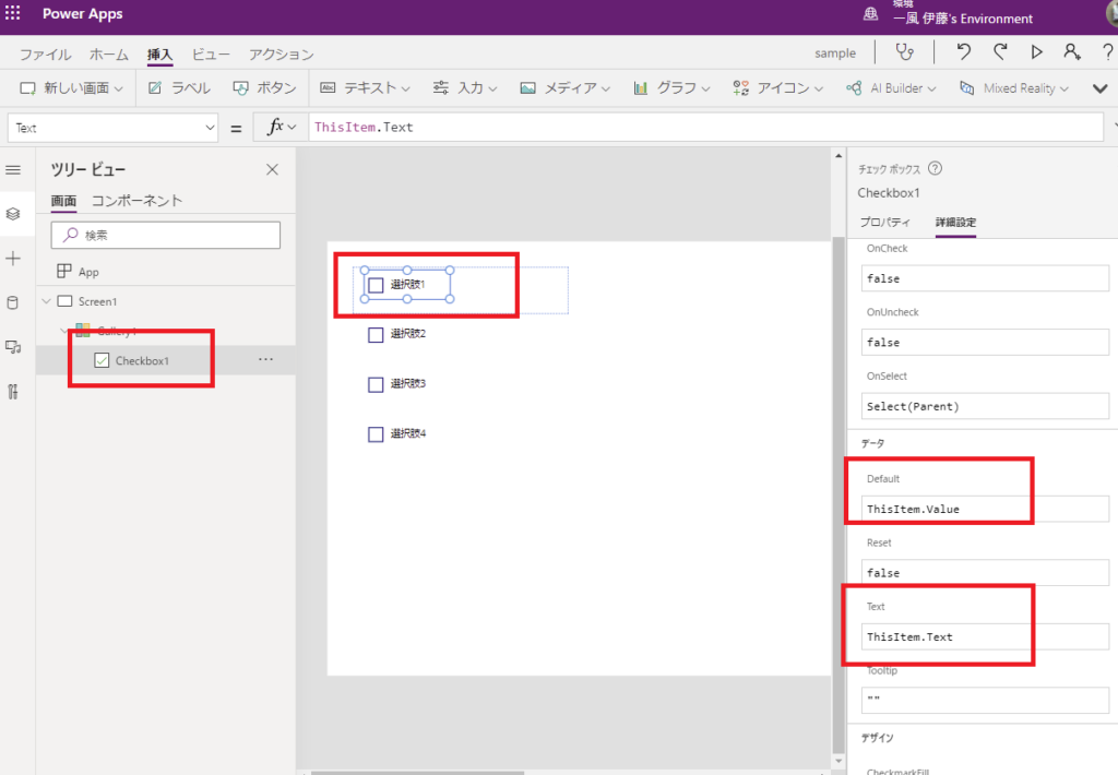
Set the Checkbox properties as follows to bind it to the collection:
- Text:
ThisItem.Name - Default:
ThisItem.Value
Step 4: Sync Checkbox State to Collection
Crucially, we need to update the collection whenever a user manually checks or unchecks a box. Use the Patch function in the OnCheck and OnUncheck properties.
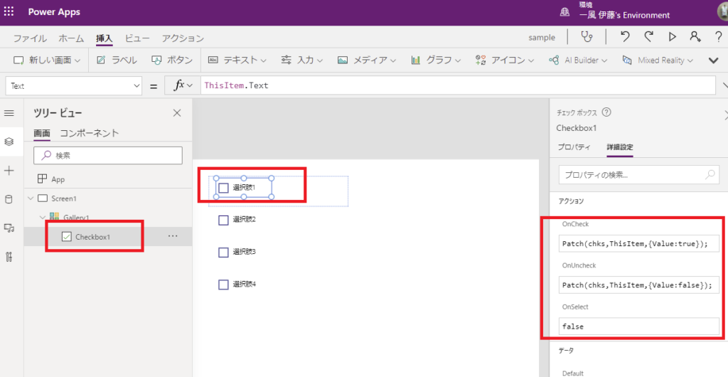
// OnCheck & OnUncheck
Patch(ColCheckboxes, ThisItem, {Value: Self.Value})
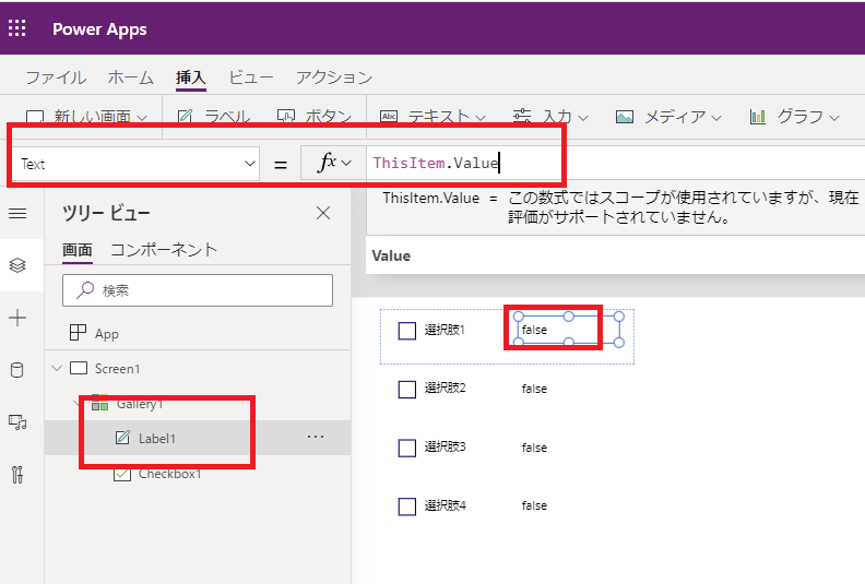
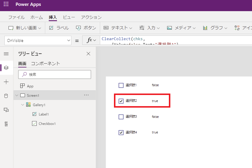
(Optional) Add a label to visualize the Value property for testing.
Bulk Operations (Select All / Deselect All)
Select All
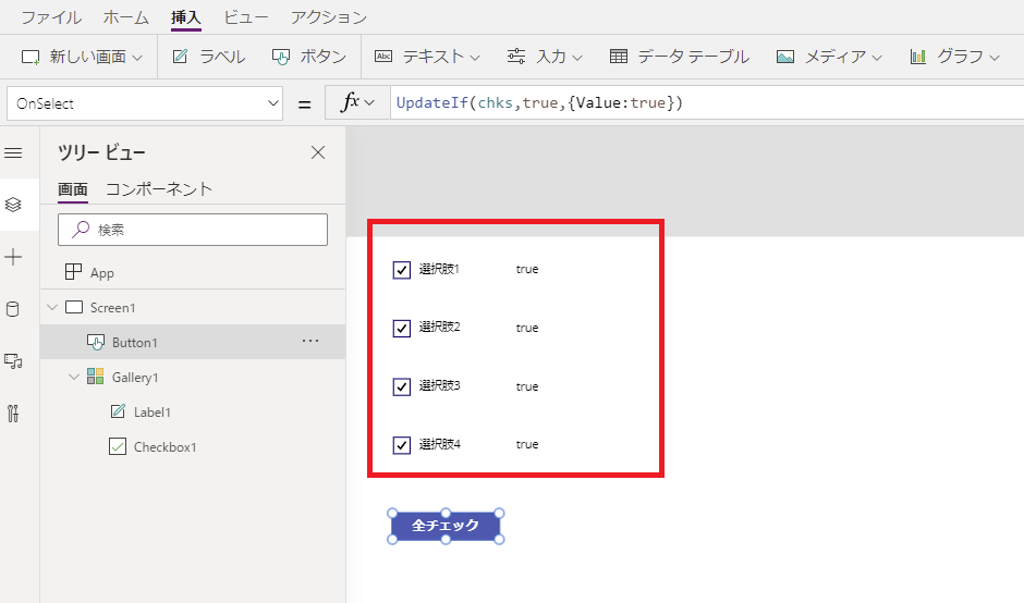
To check all boxes at once, use the UpdateIf function to update the entire collection.
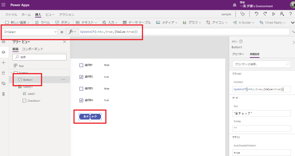
// OnSelect of "Select All" button
UpdateIf(ColCheckboxes, true, {Value: true})
Deselect All
Similarly, use UpdateIf to set all values to false.
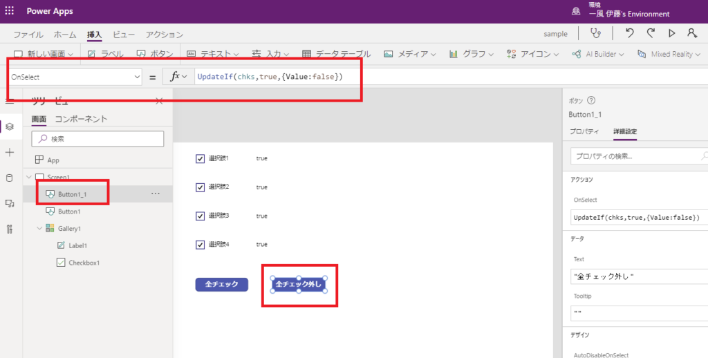
// OnSelect of "Deselect All" button
UpdateIf(ColCheckboxes, true, {Value: false})
Counting & Validation
Count Selected Items
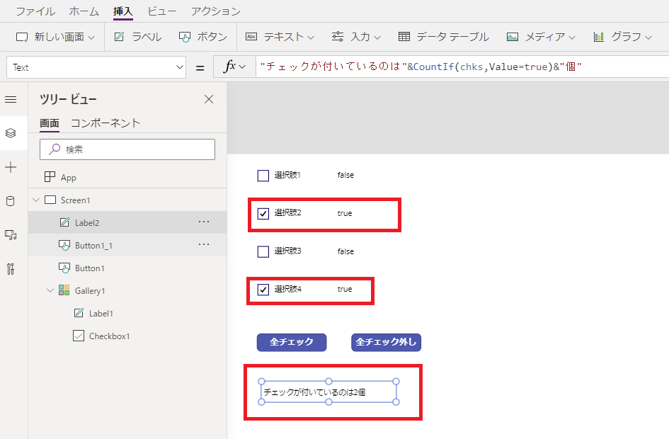
To count how many items are checked, use CountIf.
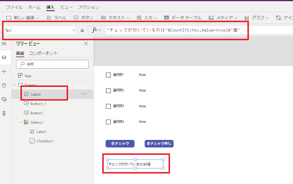
CountIf(ColCheckboxes, Value = true)
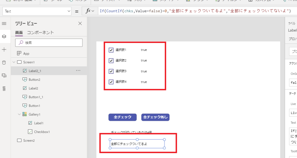
Check if “All Selected”
You can easily verify if all checkboxes are checked by comparing the count to the total rows.
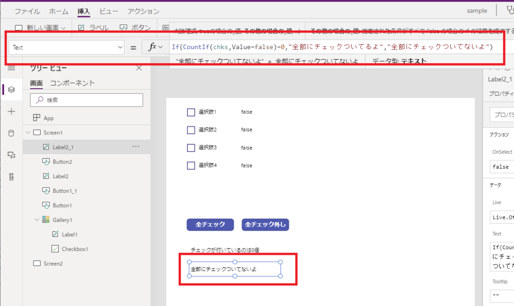
CountIf(ColCheckboxes, Value = true) = CountRows(ColCheckboxes)
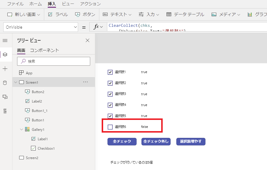
Dynamic Options (Adding Items)
Since we rely on a collection, adding new options dynamically is straightforward.
Collect(ColCheckboxes, {Name: "New Option", Value: false})
You can even allow users to add their own options via a text input:
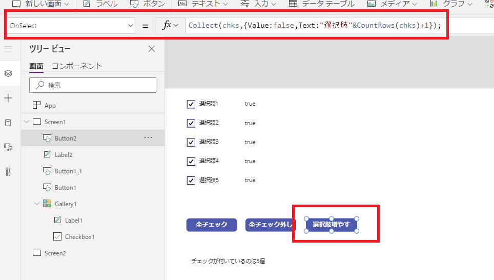
Collect(ColCheckboxes, {Name: TextInput1.Text, Value: false})
Summary
While modern Table controls offer basic multi-select, using a Gallery + Collection approach gives you ultimate flexibility.
- Full control over design and layout.
- Ability to add dynamic logic (Sum, Validation).
- Easy bulk updates using
UpdateIf.
This pattern is essential for building advanced Power Apps interfaces.
コメント