Understanding the Modern Table control in Power Apps has been one of my recent focus areas, and I’d like to share my findings.
Table Control
The Table is one of the modern controls that allows you to display data in a tabular format.
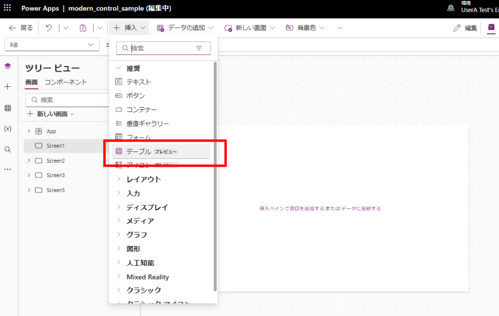
Basic Usage
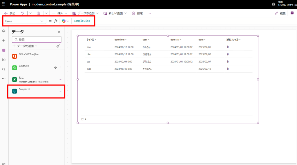
The basic usage is similar to the previous Data Table control. Simply specify your data source in the Items property to display your data in a list format:
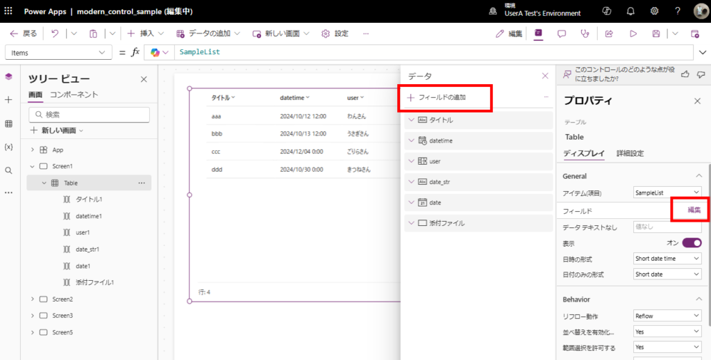
You can manage the displayed columns through the [Fields] > [Edit] menu:
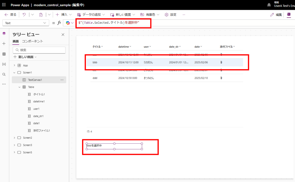
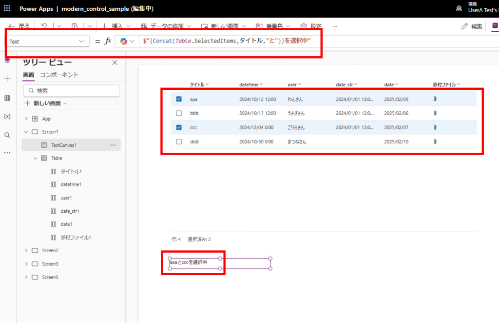
User-selected items can be accessed through either the Selected property (Record type) or the SelectedItems property (Table type):
These cover the basic functionalities. Now, let’s explore the new features introduced with the modern control.
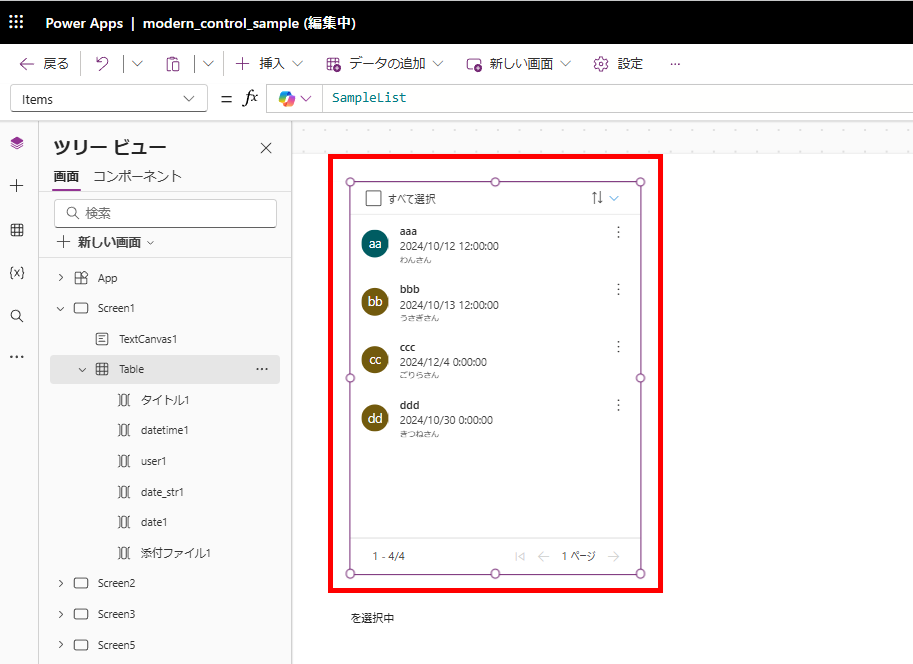
Multiple Selection with EnableMultipleSelection
Unlike the classic Data Table, the modern Table control now supports multiple row selection.
By setting [EnableMultipleSelection] to “Yes”:
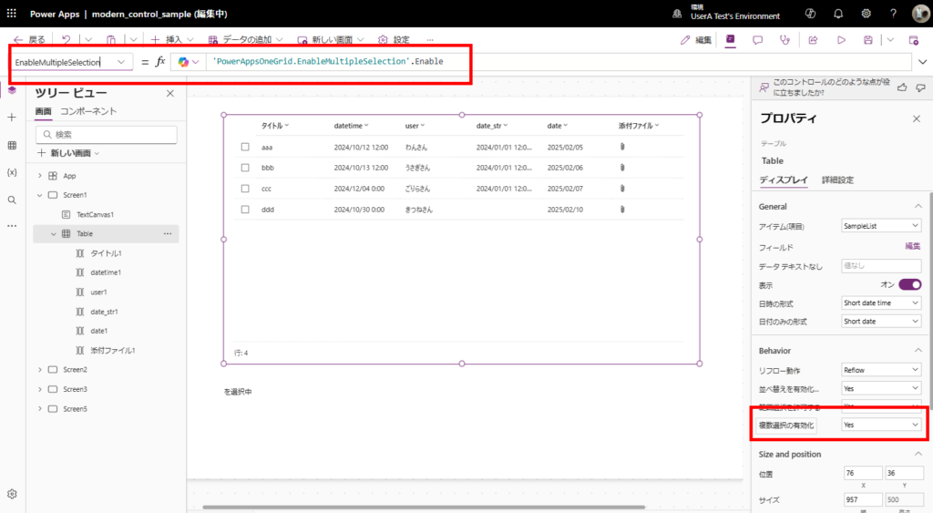
You can select multiple items as shown in the image. Access these selected items through the SelectedItems property.
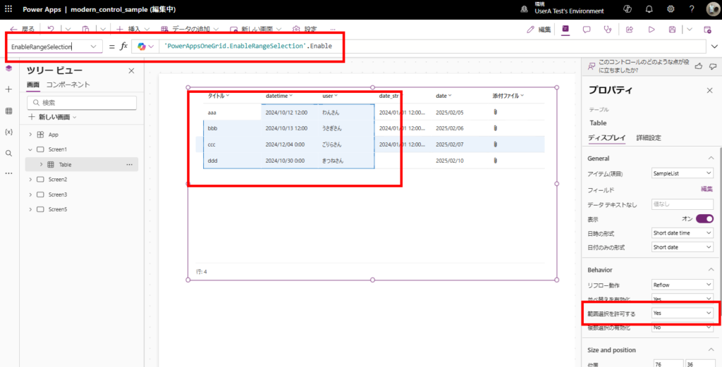
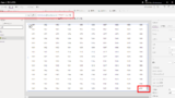
Range Selection with EnableRangeSelection
The control now also supports Excel-like range selection functionality.
Setting [EnableRangeSelection] to “Yes” allows users to select ranges as shown in the image:
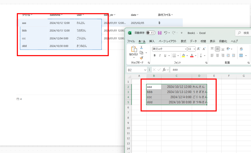
Currently, the primary use case appears to be “Select Range” → “Copy” → “Paste into Excel”:
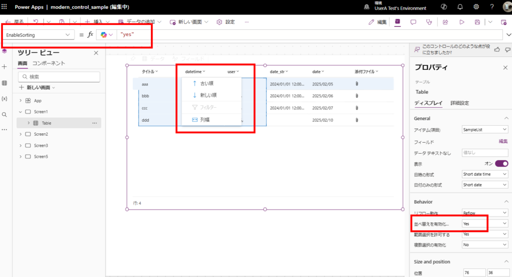
Built-in Sorting Without Sort Functions
You can now sort data without using Sort or SortColumns functions on the data source.
When [EnableSorting] is set to “Yes”, Excel-like sorting becomes available as shown in the image:
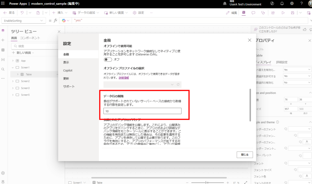
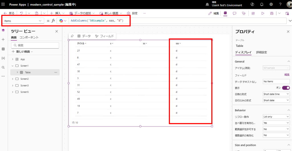
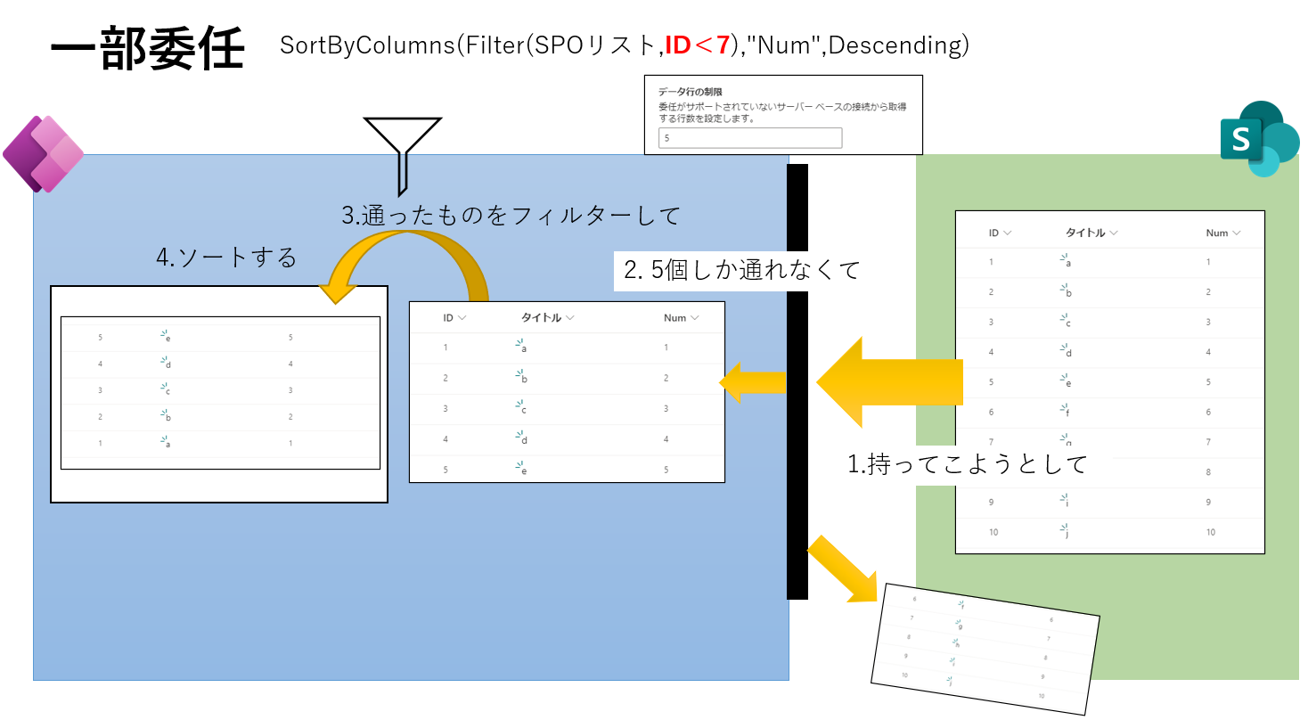
Lazy Loading Support: Understanding “Delegation” and “Row Limits”
Based on observed behavior, the Table control includes the “lazy loading” functionality similar to Gallery and Data Table controls.
When setting the [Row limit] to 10 items:
A SharePoint Online list with 501 items displays all items without issues:
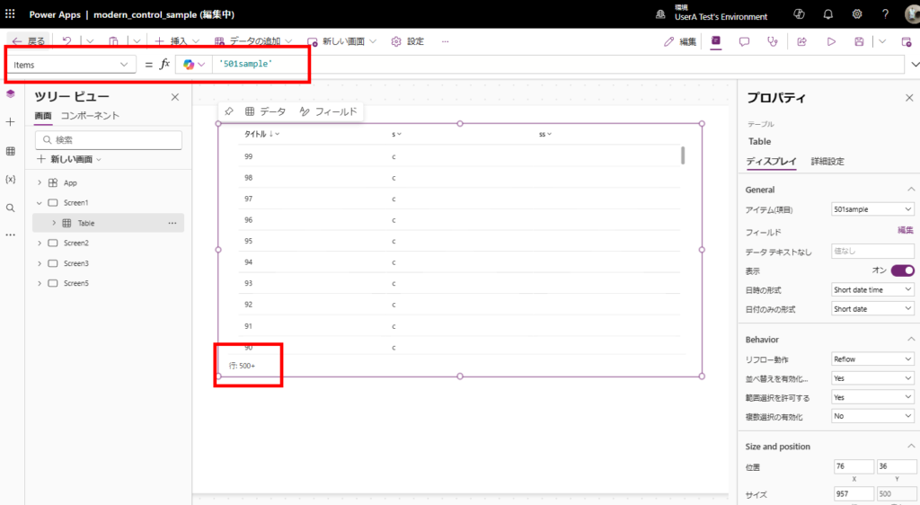
Furthermore, when using delegation-supported expressions, all records are displayed:
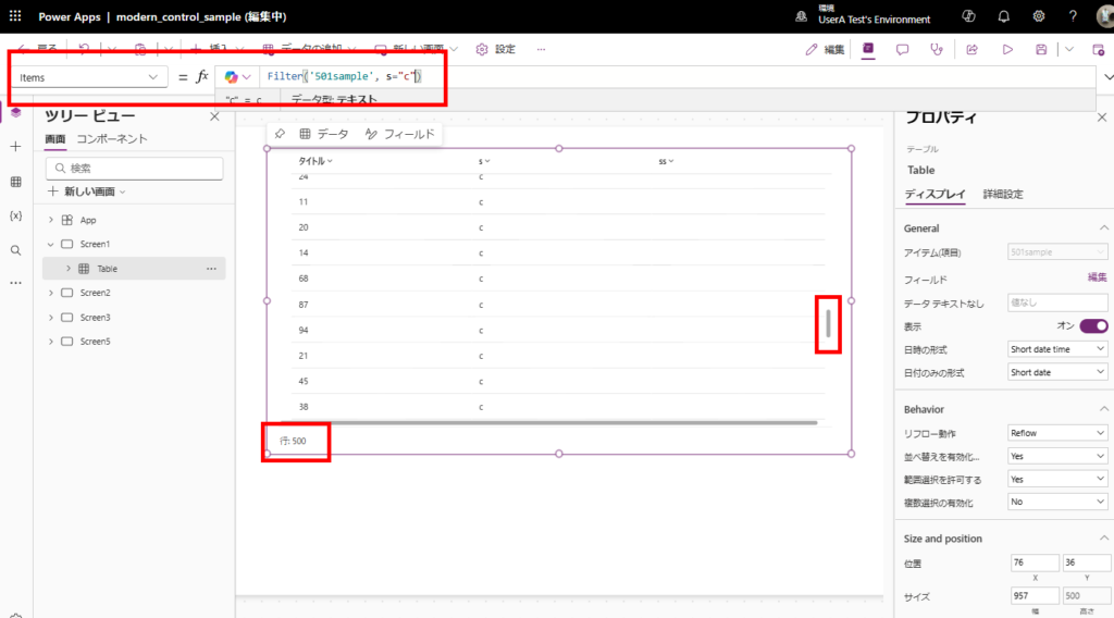
However, when using non-delegable expressions like Filter or AddColumns functions, only the number of rows specified in the row limit will be displayed:
Design
The modern control offers a significantly more polished appearance compared to the legacy Data Table.
Grid Display
The control automatically switches to List view when its width becomes less than 480px.
While this responsive design can supposedly be disabled by editing the “Reflow behavior”, it doesn’t seem to work properly at the moment… (More details below)
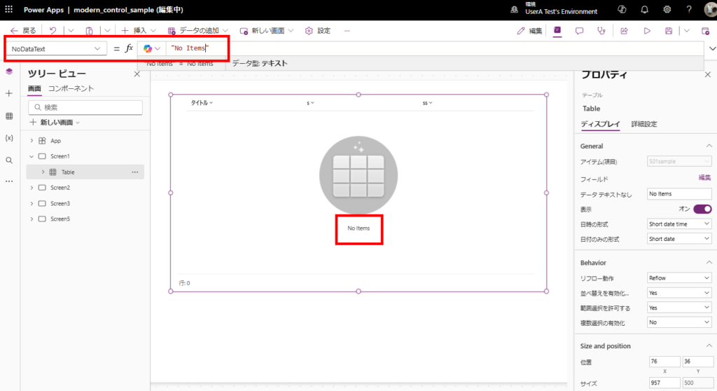
Customizable No-Data Text: NoDataText
You can now specify the text displayed when there’s no data. This is a welcome feature, as previously we had to manually add labels for this in Gallery controls.
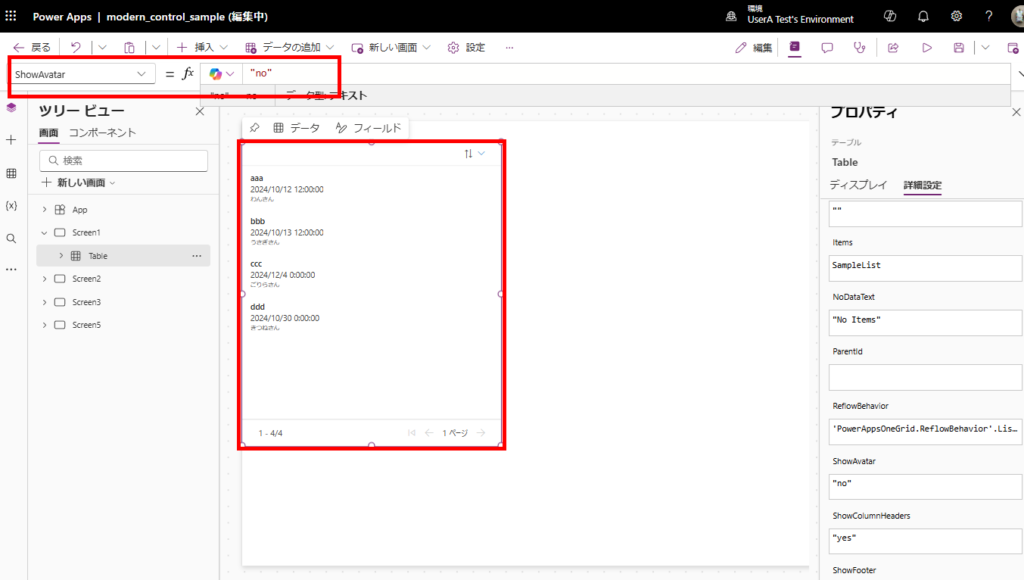
Avatar Display Toggle: ShowAvatar
The visibility of avatars (circular icons) in Grid view can be controlled through the ShowAvatar property (yes or no).
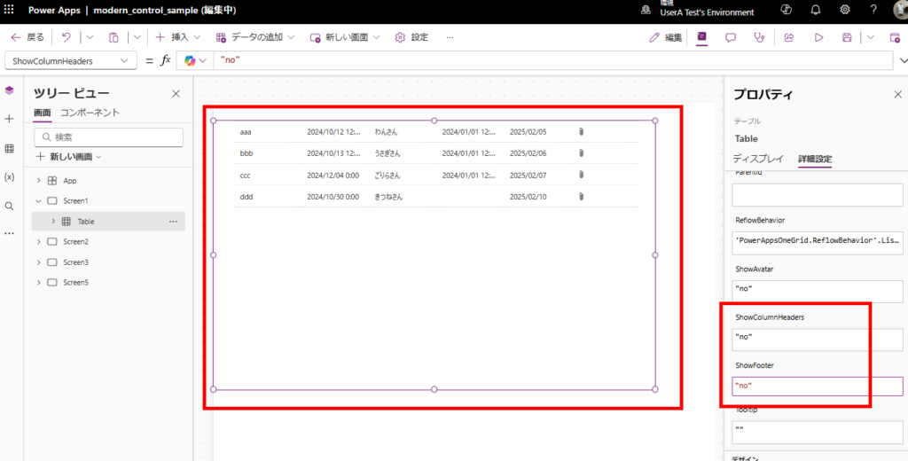
Header and Footer Visibility: ShowColumnsHeaders, ShowFooter
Use the ShowColumnsHeaders and ShowFooter properties to toggle the visibility of headers and footers.
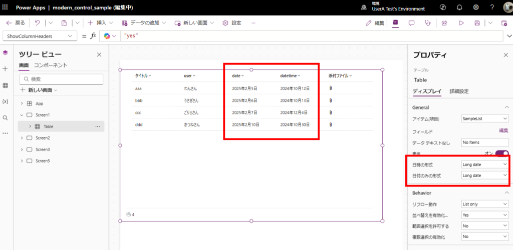
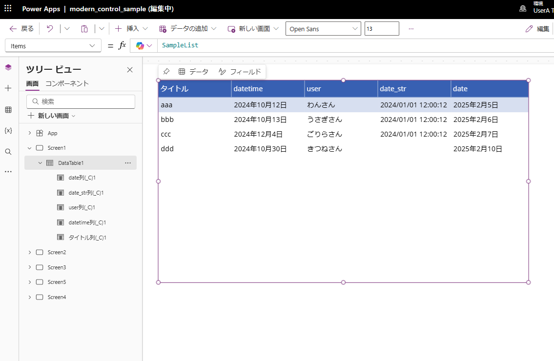
Date Format Options: DateOnlyFormat, DateTimeFormat
Date formats can be set to either Long format
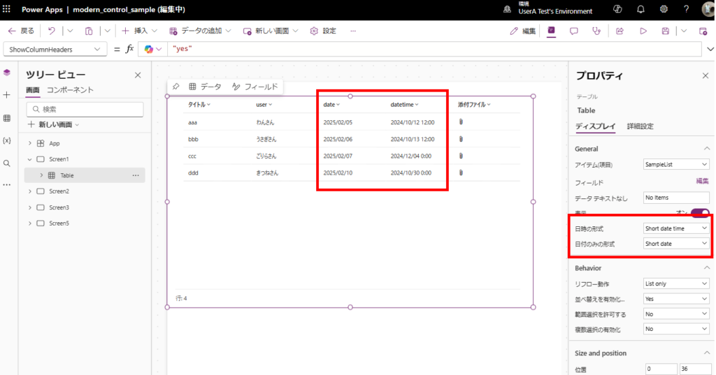
or Short format:
Currently Unclear Features
Finally, let’s discuss some features that aren’t fully understood at this time.
ChildItems_Selected, ChildItems_SelectedItems
The purpose of “ChildItems_Selected” and “ChildItems_SelectedItems” shown in IntelliSense remains unclear. ※As of February 6, 2025, no official documentation exists for these features.
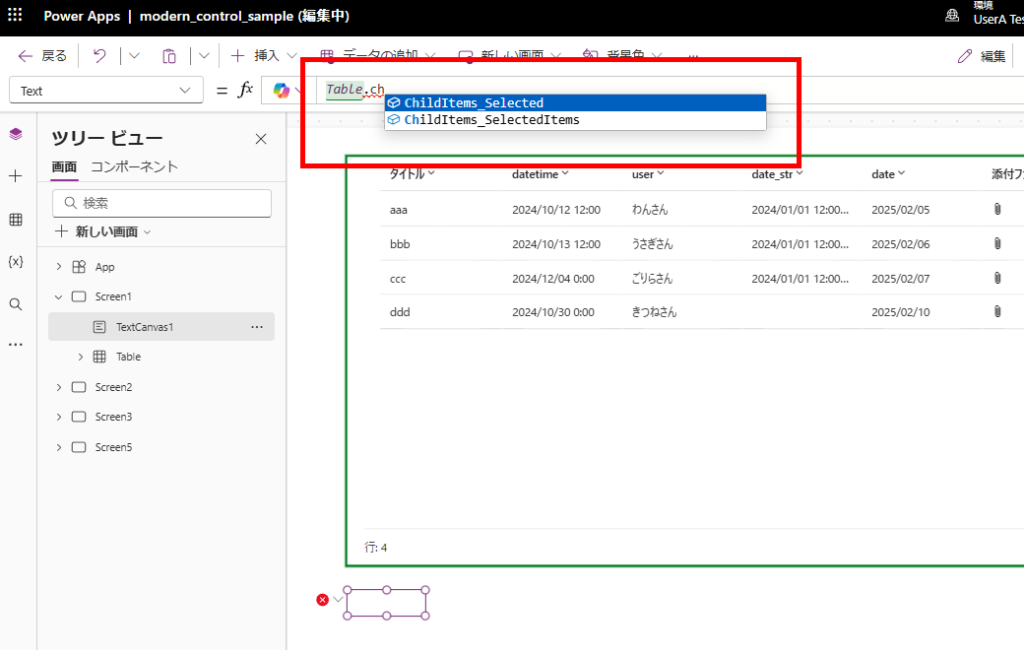
These might be related to future functionality, possibly for implementing parent-child relationship displays or grouping features.
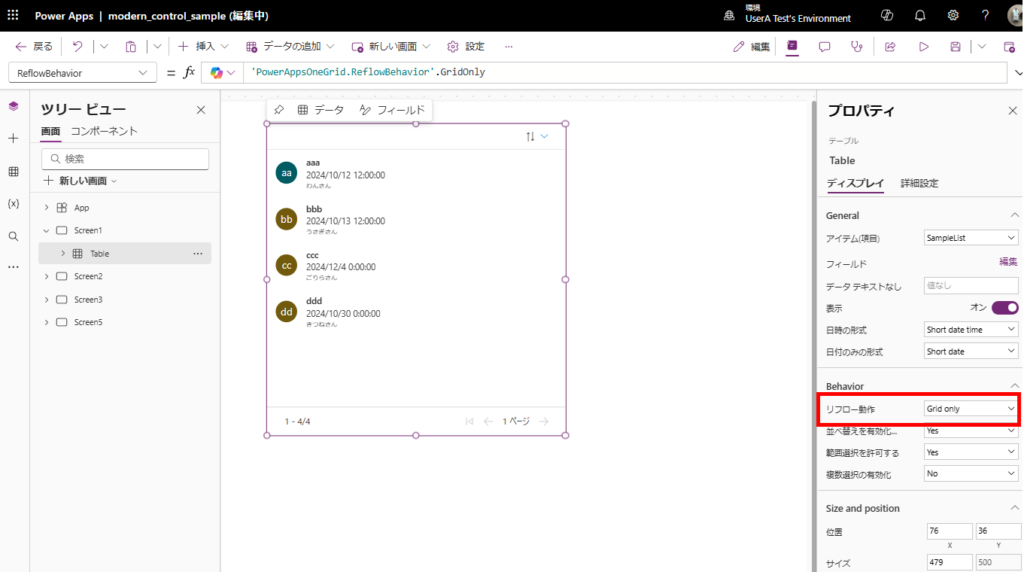
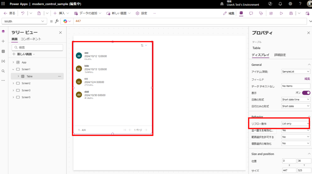
Reflow Behavior: ReflowBehavior
While documentation suggests that the ReflowBehavior property should control responsive behavior, setting it to either “ListOnly” or “GridOnly” doesn’t seem to affect the display:
While there are still some unclear features, this is nonetheless a very useful control that we’ll likely see used more frequently in future implementations.
Related Article

コメント